OrthoSolutions: Before & After
We began working with OrthoSolutions in 2023 and launched their new site in 2024. Since then, they’ve seen a noticeable shift in how they’re perceived online.
Despite having a refreshed brand and modern site, something wasn’t clicking; they needed help identifying and solving the issues holding them back. Now, we’re taking a look at the transformation and highlighting the three key areas where we made a real impact.
1. Reframing the Proposition
After a in depth site audit we identified a key issue: the messaging was aimed at patients, who aren’t choosing or even aware of OrthoSolutions’ products, instead of the surgeons and medical professionals who actually make those decisions. This misalignment meant the site wasn’t engaging its true audience.
Understanding the Problem:
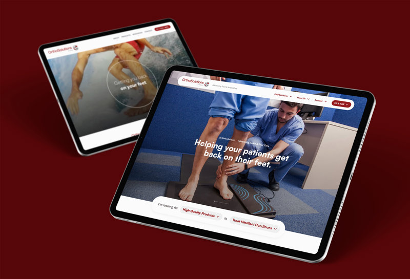
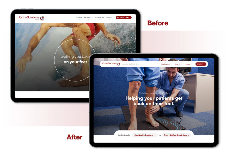
When someone lands on your homepage, they should instantly understand what you do. OrthoSolutions’ previous site tried this with the line “Getting you back on your feet” over a video montage of feet. It was simple and effective but aimed at the wrong audience.
OrthoSolutions makes products for treating foot and ankle conditions, but it’s not patients who seek out these products, it’s surgeons and medical professionals. So while the message was technically accurate, it wasn’t speaking to the people who actually use the site.
Our Solution
We made a small but meaningful change: “Getting you back on your feet” became “Helping you get your patients back on their feet.” We paired this with more clinical visuals to better reflect the medical context. Same message, but now it speaks directly to the professionals who need it.
2. Shifting to Solutions
Most businesses selling physical products tend to lead with them, but what if the product isn’t what the customer is actually looking for? That was the case with OrthoSolutions. So, we reframed the approach: instead of focusing on products, we focused on solutions.
Understanding the Problem:
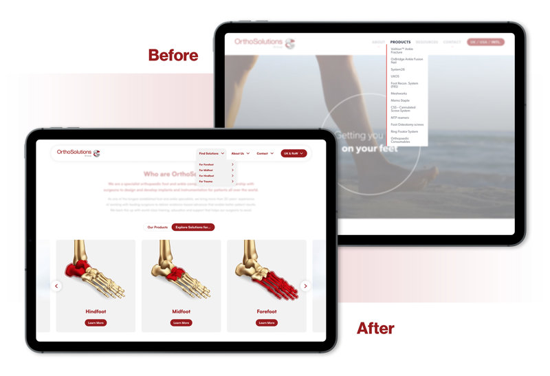
In the previous website iteration, product ranges dominated the navigation. While this works for many businesses, OrthoSolutions faced two key challenges:
Would users know what products they need without prior experience? Likely not.
Many products are used in combination to treat various conditions, so how do you present options and guide users to the best solution?
Our Solution
We shifted the focus from “Here are our products” to “Here’s how to treat X condition.” By introducing a “Solutions” approach, we reframed the experience: users no longer needed to understand the products upfront they just needed to know the condition they were treating. The site became a practical resource for orthopaedic professionals, helping them explore treatment options and build effective plans for their patients.
3. Focusing on the Details
As the saying goes, the devil’s in the details, and this site was missing them. We needed to transform it from a minimalist brochure into a go-to resource for medical professionals, offering quick, reliable access to the information they need to treat their patients.
Understanding the Problem:
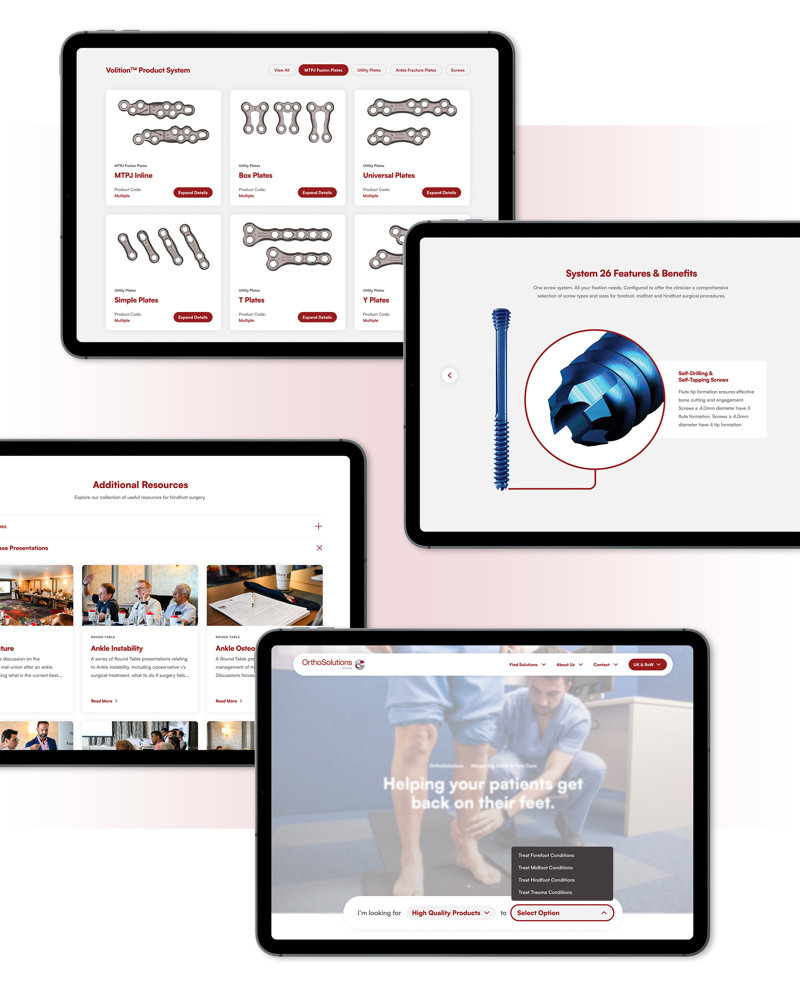
The original site lacked essential content; product details, thought leadership, and clear user journeys. Most information was buried in PDFs, hard to search, and difficult to digest especially for time-poor surgeons who needed quick, practical insights into both the products and how to use them.
Our Solution
We conducted a deep dive into the business, its products, and its users, mapping out customer profiles, user flows, and journeys. OrthoSolutions even noted our understanding rivalled that of their own team. This research shaped a smarter sitemap and content structure, connecting previously siloed information into a unified resource. We also introduced a “Quick Find” tool on the homepage, making it easier for users to access relevant content fast creating a smoother, more valuable experience.
Interested in learning more?
You can explore the full OrthoSolutions case study to see what we delivered, or hear directly from Sheena at OrthoSolutions about the project and how we helped make a difference.